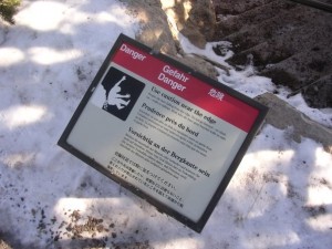
“People die here falling from the edge.”
That’s what the sign said. You can’t really understand why until you see the Grand Canyon in person.
There are just some things words fail to do justice. So how does a dude who makes his living from words reconcile that fact?

In this instance, the copy turned out to be more powerful than the slightly hilarious image.
I admit to it. And then I learn how to use it to my advantage.
That’s what this post is about—getting clear on when your copy needs to take a backseat…and let an image be the star.
“When Are Images Better Than Copy?”
Misconceptions and ill-advised assumptions abound in the copy vs. images debate, so let’s get a few things out of the way:
- Copy is not always more important than the image(s).
- The image(s) are not always more important than the copy.
- The only way to know for sure is to test.
However, the are a few best practices to be learned by doing one of my favorite things: taking a look at what the top brands in various industries are doing.
I set out with two questions in mind:
- Who’s putting the emphasis on images over copy?
- Why might they be doing so?
While answering question #1, I noticed that most of the brands/products putting a major emphasis on images fell into three different categories:
- Gadgets
- Food
- Travel
But more than that, everything I found had one thing in common—words failed to do them justice. Let’s take a look.
Category #1: Gadgets
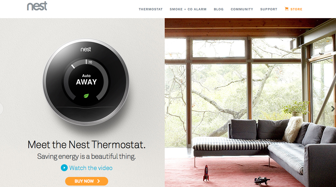
Nest
Look, Nest ain’t the only thermostat that can do cool stuff like save energy, learn your preferences, and integrate with your phone.
But it is the only one that looks this sexy.
It’s a fact—83.11% of users Instagram their Nest within 30 minutes of installation. Your whispered, “Douche,” would hurt their feelings, but they’re too busy breathing in precision-controlled, 70-degree air.
Instead of overthinking it and bombarding you with benefits, they let the characteristic that truly sets Nest apart speak for itself—great product design.
Other example: iPhone 5s (Apple always has incredible product images)
Category #2: Food
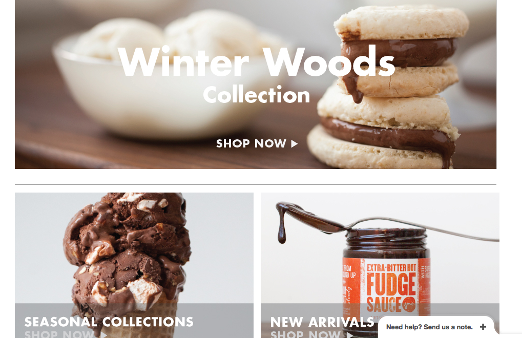
Jeni’s Splendid Ice Creams
Jeni’s doesn’t get caught up on their emphasis on local, fresh ingredients. They don’t hit you with their unique flavor combinations. They don’t focus on the fact that one of their scoop shops is likely coming to a city near you.
They just take better pictures of ice cream than everyone else. (Incidentally, they also make better ice cream than just about everyone else.)
Their emails are the same way. Even if the flavor in the picture sounds unappetizing, the picture is so great I’d still go pay $6 for a small cup of it.
Other example: (City House, one of my favorite Nashville restaurants. There are no words on the home page except the name, address, phone number, chef, and “Reservations” at the very bottom. The images perfectly capture the feel of the restaurant.)
Category #3: Travel
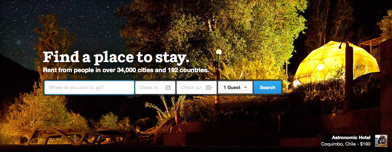
Airbnb
This is an interesting one. Airbnb has a unique concept that could be captured with the right copy, but the images show they’re ready to move beyond “quirky concept” status.
Instead of “rent a cheap room in some dude’s house” they show you exotic, unique, and hip locations all around the world:
- Astronomic Hotel in Coquimbo, Chile
- The William Brown Cabin in Hankins, New York
- Unique Portland Victorian in Portland, Oregon
The “traveled” feel brought on by the pictures is reinforced in the copy:
Rent from people in over 34,000 cities and 192 countries.
Other example: Uber (you too can be a good-looking person dressed for a formal occasion)
The Image Vs. Copy Checklist: How to Determine Your Focus
Not every brand or product that falls into any of the aforementioned categories should emphasize images over copy, of course. If images are seldom emphasized in your category, all the more reason to try one out.
Before you do, however, use this checklist to ask yourself five key questions:
- Can words do it justice? (Be honest—just because the words don’t immediately come doesn’t mean they’re not out there.)
- Is appearance its greatest benefit? (Again, be honest. It’s not always what you think its greatest benefit is. It’s what the customer thinks the greatest benefit is—regardless of whether they’re willing to admit it.)
- Do I have a picture that does it justice? (If you’re going all-in with an image(s), it better be good. Look at the previous examples. Skimping is not an option.)
- Which can I implement and test the quickest? (If you’re smart, you’re going to test anyway. If you’re on the fence, go with the quickest option and see how it works while you work on getting the other version ready.)
- How can I use copy to reinforce the feelings and emotions the image triggers? (Assuming you’re emphasizing the image over the copy.)
A Few Caveats…
- Just because the image is big doesn’t mean it’s the critical aspect of the page. Check out the home page over at Help Scout. There’s a big picture, but it’s only there to reinforce the awesome testimonial that succinctly describes and endorses Help Scout’s key benefit: “a simple, straightforward way to provide excellent support.”
- It pays to know a bit about the psychology, statistics, and best practices of image selection and placement. This KISSmetrics post is a helpful resource.
- Test. Test. Test. Again, this post covers image-heavy strategies that may be working for some people. It’s designed to get you thinking, not to hand you the “secret magical solution.” Write down your ideas, and then test them. Never assume.
The freelancing business I started my last semester of college was called Six Words Studio. The hook on the home page reads:
Though a picture may be worth 1,000 words, you don’t need 1,000 words to paint a picture. Six Words Studio provides profoundly simple professional writing, custom-geared for every client.
It’s true. Words can deliver your desired message in a way images can’t. But sometimes it pays to admit the converse is true too: images can deliver a message when words fail.
Question: What other brands/products do you think emphasize images over copy in a good way?


