If your company lasts long enough, one thing is certain—it will eventually go through a rebrand.
(Unless you’re Craigslist.)
And OK, other things are probably certain too, but just continue this train of thought with me for a second.
Anyway, when you do go through the rebrand, something very scary will happen…
…the internet will find out.
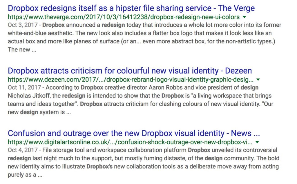
Have you seen how the internet reacts to rebrands? If you need a reminder, just Google “company x rebrand” or “company x redesign” and see what comes back. Example:

The internet demands its steady diet of hot takes, and those hot takes get aggregated into article after article.
But rather than focusing on new logos or brand colors, I always find myself most interested in the other changes companies make to their websites—copy, positioning, what aspects of the product they decide to focus on, and the way all of those things interact with the overall design.
Most companies aren’t going to A/B test their rebranded homepage design and copy against their current one with all the old branding, because the goal of a rebrand goes beyond just web conversion rates.
You make sweeping changes and bet big on a new direction, focus, or emphasis—and that makes for a fascinating time to look closely at the homepage and analyze exactly what’s going on.
Instead of, you know, just going “LOLOLOL look at this new logo what were they thinking.”
The Rebranded Typeform Homepage Breakdown
If you’ve taken an online survey in the past few years, there’s a good chance you’ve interacted with Typeform.
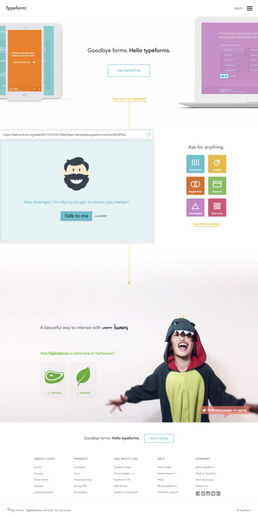
It’s a great product, so when they announced their big rebrand I knew it’d be a great opportunity to dive into the new homepage and break it all down.
The rebrand made them move on from the homepage design and copy they’d had for nearly two years:

So, what did they replace it with? As you’ll see, the rebranded versions takes a lot of steps forward, but also has room for improvement. Just click the right arrow below to get started with the breakdown!
Tip: If you’re on mobile, turn your phone to landscape for the best experience.
Take a look and let me know what else you notice! There are plenty of other things about it we could’ve discussed, but I tried to keep the breakdown focused on what I think are the most important details.
