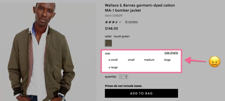
If you buy clothes online, you’re probably used to the dread that gathers in the pit of your stomach when you see this section of the page:

Which size am I again? Do their jackets run big or small? Ugh, I don’t want to have to return this.
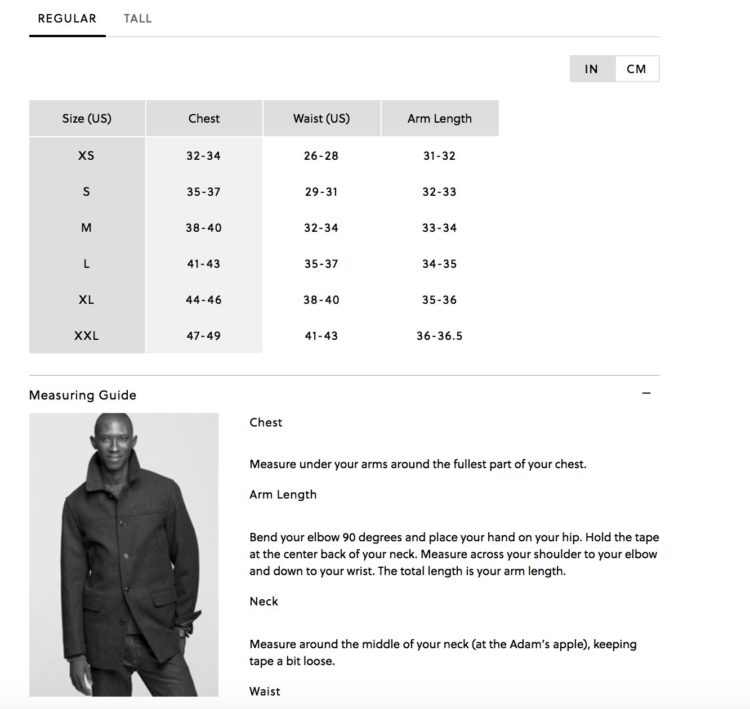
These are the thoughts that plague the modern clothes-wearer. They’re what push you to click that little link you’d rather ignore—size charts. And when you do, your worst fears are realized:

Chest size. Arm length. Neck measuring.
Of course I don’t know these things. And am I about to get out of bed, dig into my nonexistent tailor supply kit, and follow these complicated instructions to figure them out?
Nah. I’m either going to:
- Flip a coin between “Small” and “Medium,” feel zero confidence in my selection, and pray it fits.
- Get frustrated, shut my computer, and go eat a leftover slice of pizza over my kitchen sink like a rat.
That was the old way—and it sucked.
That’s why I was so excited to discover a completely different approach to the process while ordering a jacket from Patagonia.
So excited, in fact, that I stopped what I was doing, recorded a video of the process, and shared it on Twitter.
It quickly became one of my most popular tweets ever. Apparently, I’m not the only one who hates the traditional online sizing process:
Patagonia’s “what’s my size” feature is one of the most helpful ecommerce things I’ve seen. Gives them some good data too pic.twitter.com/eM2cT2muum
— Will Hoekenga (@willhoekenga) December 25, 2017
That’s evidence enough that Patagonia obviously offers a superior user experience.
But the truth is, there’s a lot more to the process than a 15-second GIF can show, including some subtly brilliant copy.
Let’s dig in frame by frame so you can see the little details that take this experience to the next level, as well as an underlying phenomenon that I believe brings customers even more satisfaction in their purchase.
Click the right arrow below to start.
Tip: If you’re on mobile, turn your phone to landscape for the best experience!
The IKEA Effect and Effectance
When my jacket arrived and fit perfectly, I couldn’t help but notice the overwhelming sense of personal satisfaction I felt.
At first, I figured it was probably just because I paid so much attention to the Fit Finder process. But when I came across something called the IKEA effect, I realized there might be more to it.
The IKEA effect was first described by Michael Norton (Harvard Business School), Daniel Mochon (Yale), and Dan Ariely (Duke) in a study they published back in 2011.
In a nutshell, they found that people tend to value things more when they have a hand in making them. IKEA furniture (which you have to assemble yourself) was just one of the examples they researched.
So, am I saying the IKEA effect is at work in Patagonia’s Fit Finder process? Not exactly. Answering questions about your physique and preferences isn’t quite the same as spending an hour assembling a desk.
But the IKEA effect study was built on a large body of past research that demonstrates a fundamental human need for something called effectance. As the authors define it, effectance is “an ability to successfully produce desired outcomes in one’s environment.”
Basically, we humans like the feeling that we’re influencing (i.e. having an effect on) the good outcomes in our lives.
That’s what I think the Fit Finder process offers customers—the perception that they have greater control over their purchase’s fit than ever before.
When that jacket comes in the mail and feels just right the first time you put it on, there’s a small part of you that says, “I did this.”
The process of answering those questions, providing personal details, and completing tasks makes you perceive greater control over the positive outcome, and that’s a feeling we all crave.
Where Else Could This Process Be Useful?
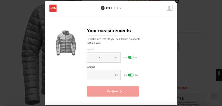
Although this post has been focused on Patagonia, it appears the Fit Finder tool is actually built by a third party, as there are other clothing companies using it too. Here it is on The North Face’s site, for example:

Still, I think there are interesting applications beyond helping people find the right clothing fit. At its core, it’s designed to simplify a tough decision-making process for shoppers, and that happens in plenty of other settings.
What about software pricing pages, for example? Prospects frequently struggle with picking the right software plan. That’s part of the reason why you see a lot of live chat widgets on pricing pages. So why not try self-serve selection assistance?
When I worked at Leadpages, we added a video on the pricing page that helped people pick the right plan had a strong positive impact. In fact, they’re still using a video on their pricing page over two years later.
While I don’t think the feeling of effectance would be as strong (there’s not as strong of a “realizing you picked the perfect fit” moment after you buy a software plan), matching customers with the best plan should help retention.
Or what about Netflix? Sure, they already do a great job surfacing content you might like based on your viewing habits, but that still doesn’t stop me from browsing for 20 minutes only to end up watching nothing sometimes.
Something designed more to help me find something to watch based on how I’m feeling right now would be interesting.
But enough of what I think—what do you think? Where else have you seen a process like this, and where else do you think it could be tested? Leave a comment below and let me know!
