For a long time, people (including me!) have fawned over the fun, delightful bits of copy MailChimp sprinkles throughout their product and marketing assets.
But it’s become increasingly obvious that there’s a lot more than just fun branding to the self-funded Atlanta company that’s grown to over 16 million customers and 700+ employees. And people are noticing.
The New York Times covered them twice in 2016.
Fast Company named them one of the most innovative companies of 2017.
Oh, and Inc.com just topped it all off by naming them “Company of the Year” for 2017.
That’s just a sampling.
The point is, MailChimp is up to something interesting. I wrote earlier this year that they were undergoing a fascinating repositioning of their brand—a transformation so big that I was convinced they might change their name.
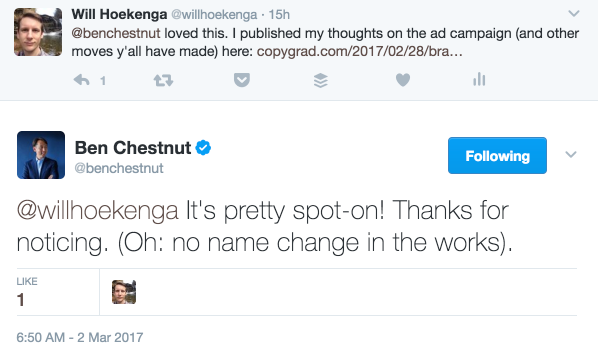
Their CEO, Ben Chestnut, thankfully provided some clarity for me on Twitter:
But since I wrote that article, their transformation from “platform that solves your email needs” to “platform that solves all your small business marketing needs” has only intensified. So I thought it was high time to take a giant, 16-year-sized step back and really see how their copy, positioning, and strategy have evolved from day one.
To do that, I used the Wayback Machine to analyze every (recorded) change they made to their home page since 2001 (just like I did with Basecamp), and scoured the 376 pages worth of blog posts published to their company blog.
The result is this post, which has two parts below:
- A fun, visual tour of the last 16 years of MailChimp home pages, so you can see how it evolved (along with my commentary).
- A deep dive into 3 major strategic decisions that I think had a huge impact on the way they write about MailChimp (we don’t talk enough about strategy’s impact on copy).
Let’s dive in!
Part 1: A Visual Breakdown of the MailChimp Home Page: 2001-2018
Buckle up, because we’re about to see how the MailChimp home page has gone from…
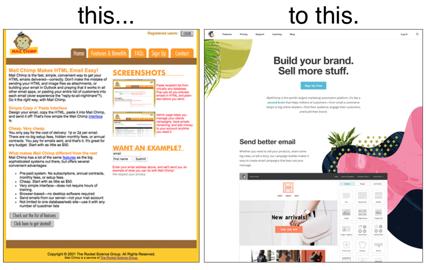
The visual breakdown works like a slideshow: just click the arrow on the right side to advance (after you click the first time you can simply use your arrow keys).
Tip: If you’re on mobile, turn your phone to landscape for the best experience!
Part 2: 3 Strategic Decisions That Shaped MailChimp’s Marketing
Want to get yourself into trouble when analyzing another business’s copy? You only have to do one thing—judge it out of context.
For example, when I saw that MailChimp had the following version of its home page up for only a couple of months in 2009, I immediately thought, Well, it makes sense that it didn’t last long since the headline doesn’t tell you anything about the product or how it can help you:
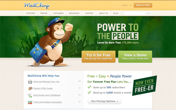
Thankfully, I did enough digging to learn that “Power to the People” was the theme for the huge marketing campaign MailChimp used to launch their freemium plan.
That means that a large percentage of their visitors at that time had already been primed with “Power to the People” messaging and were flocking to the site precisely to check out the all-new free plan.
With that context in mind, the headline makes sense. (On that note, perhaps that’s what they were going for with the “Being yourself makes all the difference” headline as well—continuing the experience from the brand advertising people were encountering at the time.)
That’s why you can’t judge copy by simply comparing it to headline templates that are commonly accepted as effective. Or checking off an imaginary “Yes, this speaks to benefits rather than features” box. You’ve gotta dig deeper.
That’s my aim with this section: to paint a picture of the strategic decisions that informed much of what the breakdown covered.
#1: The Chimpovator’s Dilemma: How MailChimp Kept Their Value Proposition Focused While Protecting the Bottom of the Market
“Uh oh, an uber-simple freemium competitor.”
That was Ben Chestnut’s first thought (according to this blog post) when he saw an email newsletter app called TinyLetter that launched in 2010. It looked like this:
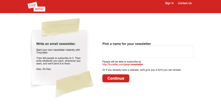
MailChimp had a hair under 1 million users at this point, so it’s easy to look at that TinyLetter site and think, Wait, why would he have been worried about these guys? There’s masking tape on their site!
But if you look closer, you’ll see that TinyLetter was offering something MailChimp couldn’t at the time—an email newsletter for people.
Everything about MailChimp, from the product to the website, had been built with business in mind since day one. As it got easier for individuals to create their own little online platforms that created a problem: even the free version of MailChimp seemed too powerful and too businessy for them. As Ben put it:
“Now that it’s so easy to get found and build a following via social networks, there are tons of new people out there who want to send email newsletters to their contacts…And since MailChimp is the most powerful free email marketing app out there, we’re kinda the obvious choice. The deal’s so good, it’s almost as if we’re *forcing* people to use MailChimp. And for a lot of those people, they actually resent us for that. If you’re a business looking for email marketing solutions, MailChimp is the best, easiest-to-use app out there (ahem, imho). But if you’re not a ‘business,’ MailChimp can seem like overkill.”
So…what were MailChimp’s options in this scenario? They could have:
- Ignored TinyLetter and hoped that they didn’t someday morph into a more direct competitor.
- Started trying to appeal to both businesses and individuals, and potentially watering down their brand in the process.
It’s a classic example of the innovator’s dilemma! TinyLetter was a less powerful product going after less valuable (monetarily speaking) customers, which is exactly what most disruptive companies look like at first.
In a move that surely made Clay Christensen proud, MailChimp decided to thumb their nose at options 1 and 2 and go with a third option: acquiring TinyLetter.
They announced the acquisition on August 31, 2011, along with the important distinction that the two products would remain separate. This allowed them to market each product specifically to the types of customers they were built to help. When you look at the two sites circa 2011 side-by-side, it’s easy to see how different they were:
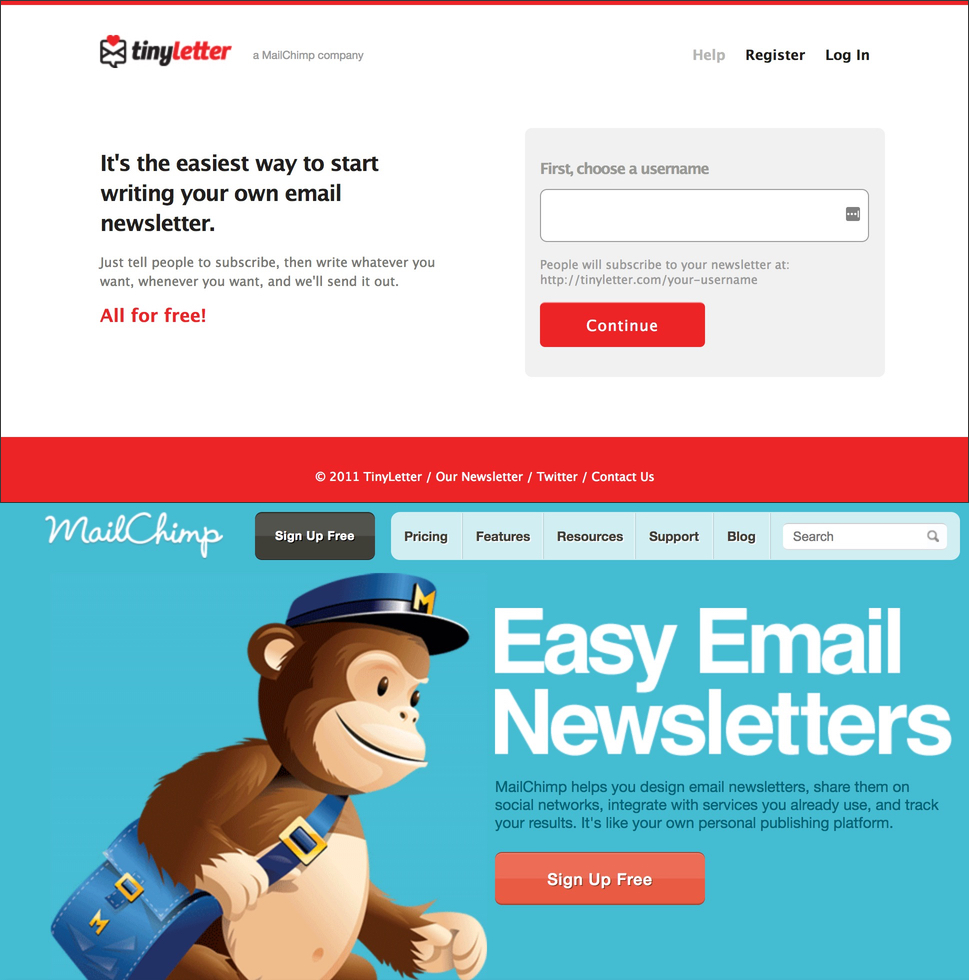
The headlines both mention “easy” and “email newsletter,” but they’re still clearly talking to very different types of customers.
This is what I mean when I say that we often overlook the impact strategic decisions have on copy.
It would have been so easy to say, “People need to be able to understand that they don’t have to be a business to use MailChimp—change the home page copy!” instead of acquiring TinyLetter.
It’s also easy to imagine an alternate reality where they remade TinyLetter as “MailChimp Lite” instead of keeping it separate, which only would have invited more complexity to the home page.
Choosing to keep it separate allowed them to keep MailChimp.com’s copy focused exactly where it needed to be—on the needs and problems of small businesses.
Often, the changes you don’t make are just as important as the ones you do.
Side Note: This excellent detail and quote Farhad Manjoo included in his 2016 piece on MailChimp for the New York Times felt more relevant than ever when I started thinking about the TinyLetter acquisition:
“MailChimp is run out of two sprawling floors in the Ponce City Market, a massive complex in Atlanta’s Old Fourth Ward neighborhood that was originally built as a Sears Roebuck warehouse. ‘A lot of people think it’s cool and vintage, but it’s actually a neat reminder of disruption,’ Mr. Chestnut said. ‘Sears used to be the biggest thing, and then it went away.’”
#2: Small Business or Enterprise? Neither.
Initially, I was completely thrown off when I came across these lines from a blog post Ben Chestnut published back in 2010:
“It seems like a lot of ESPs gravitate toward serving either ‘small business’ or ‘enterprise’ customers. A year or two ago, we arrived at a similar fork in the road. . . . So which did we choose? Neither. Or both, depending on how you look at it.”
Wait, what? How could he say that when every bit of press MailChimp’s gotten over the last few years has presented them as champions of small business who have always resisted the Silicon Valley soothsayers telling them to go after enterprise customers??
My brain was already halfway through drafting an entire thread of 🔥 outrage tweets before logic prevailed and I took a closer look at the blog post.
See, the post was prompted by a question people were starting to ask them more and more at conferences. As Ben put it:
“Apparently, people are a little confused about MailChimp. They ask us, ‘You guys are powerful and innovative and fun and all, but can you handle large lists, like some of the enterprise solutions out there?’”
He followed that with a detailed technical (but interesting) explanation of MailChimp’s decision to build the product in a way that allowed it to handle both large and small lists.
This was different from other email service providers at the time, who either built their products exclusively to accommodate the needs of enterprise customers with large lists or small business customers with small lists.
But here’s the deal: all this really does is point out the false dichotomy that customers are either small businesses with small lists or enterprise companies with large lists.
I mean, off the top of my head right now I can think of a handful of friends who run small businesses with email lists of 100,000+.
They weren’t really choosing to build a product for both small and enterprise companies. They were choosing to build a product that worked great for both small and large lists. Given that it’s become easier than ever over the last several years for small businesses to build large lists (as more and more companies have democratized high-end marketing tech), that was probably a wise decision.
So what does this have to do with copy?
Building a product that put no limits on a small business’s success gave them the freedom to bake that feeling into how they marketed the product. Just look at this excerpt from Ben’s post about the site’s 2011 redesign:
“It’s been a few years since we launched the one you’re looking at now, and our user base has changed quite a bit since then (we’re getting tons more high volume senders), and we’ve noticed more and more people using MailChimp as a ‘platform’ (not just a newsletter tool). . . . I asked our team to consider all the above, and gave them a one-word theme: ‘Pro.’
Then, as I fully expect of my employees, they totally ignored me and came up with more useful criteria.
The new look better represents the powerful, innovative features we’ve become known for, but in that creative way people have come to expect from us.”
Essentially, their challenge has been to market a product built for both brand new and super successful small businesses.
Um, duh…doesn’t just saying your product is “for small business” solve that challenge?
I don’t think it does! And that may be why you won’t really find much (if any) language like that on any recent MailChimp home page iteration.
Instead, you’ll find phrases like what’s currently on their home page (emphasis added): “It’s like a second brain that helps millions of customers—from small e-commerce shops to big online retailers—find their audience, engage their customers, and build their brand.”
The trouble with positioning yourself as “X for small business” is that “small business” can be a highly subjective term. After all, a “big online retailer” can still technically be a small business!
And if you’re one of those customers with a 100,000+ email list that does tons of advanced email marketing stuff, but is also technically still a small business, that label might leave you wondering, Am I small business enough?
That’s why I think the redesign’s one-word theme of “Pro” was a great choice. While “small business” language might not resonate with every small business in this context, no small business wants to look like an amateur.
And guess what? Six years later, it looks like investing in that theme has paid off. Here’s what Ben said about MailChimp’s decision to launch their Facebook ads feature in early 2017:
“Our customers tell us that MailChimp helps them look pro and grow. It’s not an email platform, it’s not a newsletter tool—it’s the thing that helps them look more professional.”
They’ve long said their strategy has always been to not coddle the small business. That line of thinking freed them create a brand that resonates with small businesses both small and, er, large.
#3: Freemium: MailChimp’s Version of Steph Curry
In MailChimp’s case, there’s a lot more to it than the usual “freemium vs. free trial” debate covers.
Ben Chestnut gave a tongue-in-cheek overview of MailChimp’s unusual approach to freemium in the 2009 post that announced their “Forever Free” plan, which made MailChimp free until you went over 500 subscribers or sent over 3,000 emails a month:
“I just read about this ‘freemium’ approach to web startups. Basically, you build a cool app, make it free, build up a bunch of users, then find a way to ‘monetize’ later. D’oh! Why didn’t anyone tell us about this when we started in 2001? We wasted all this time building a strong, profitable company with an awesome product and over 100,000 users, when we coulda been just giving it all away? We’ve got to make up for lost time, people!”
But the real insight came a year later, when he published “Going Freemium: One Year Later.”
I suggest reading the whole post because, over 7 years later, it’s still really insightful, but for now here’s a small chunk that describes part of what he calls the company’s “bass-ackwards” approach to freemium:
“The second thing people don’t always get about us is that we’re not taking the conventional, ‘build a stripped down product, make it free, then up-charge if people want more features’ approach to freemium. We spent years building up a powerful, affordable, profitable, self-serve product. We invested heavily in our API, which now has more than 70,000 users. We got smarter at deliverability, scalability, and abuse prevention. Then, the cloud made all of the above even cheaper. We took advantage of those savings and made stuff free.”
As much as I hate this analogy, their approach to freemium was ultimately like rocket fuel for their growth. After the first year, their user base grew from 85,000 to 450,000. They were adding 30,000 new users and 4,000 new paying customers each month.
Today, they’re at over 16 million users. Obviously, freemium isn’t the only factor in that total, but it was definitely a spark that helped them gobble up a huge percentage of market share.
So what impact did this have on their copy? The obvious one is that it allowed them to keep things pretty damn simple. From 2012 until 2017, there usually wasn’t more than just a headline, one paragraph, and a call to action on their home page.
When you’re the only email marketing platform that’s letting users have 2,000 subscribers and send 12,000 emails per month for free (they’ve continued to expand the Forever Free plan), you don’t have to spend as much time talking about all your features.
As a MailChimp user who went from zero to 2,000+ on the freemium plan, I can definitely say it felt too good to be true the whole time I was getting all that power for free. Choosing them to start my list was a no-brainer.
Having an offer that basically no one else can compete with will always impact the way you write your copy.
But perhaps a less obvious benefit is the freedom and confidence this kind of success gives you. Ben hinted at this when they hired Jon Hicks to redesign the MailChimp logo back in 2008. Once they had the new Freddie, they decided to do away with that “corporate and stodgy” (as he described it) site design (the one that I said drained all the fun from the site) and plop the new Freddie front and center on the home page. Ben wrote:
“Since late 2007 we’ve been adding some unbelievably powerful tools and features to the MailChimp product, like A/B splits, RSS-to-email, Google Analytics integration, ROI tracking, list segmentation, an awesome API, and on and on. We’re having lots of fun innovating and making powerful stuff (that’s easy to use). And when you’re doing awesome stuff you can be bold with your branding, and have some personality.”
Sure, the Forever Free plan wasn’t around yet when he wrote that, but I still think it falls under the definition of “doing awesome stuff.” The kind of real value that lets you be bold with your branding, copy, and marketing.
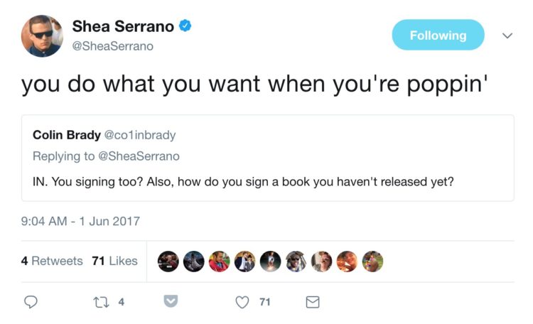
In the words of Shea Serrano (who turned his MailChimp newsletter into a book deal that resulted in a #1 New York Times bestseller), “You do what you want when you’re poppin’.”
If you think of MailChimp as an NBA superteam (because why wouldn’t you), a good comparison is the current Golden State Warriors (apologies to their hometown Atlanta Hawks, who we’ll just say are…a work in progress).
Their product is Kevin Durant—an MVP and champion who’s arguably the best player in the league.
Their brand is Draymond Green—fun, unorthodox, and unlike anyone else at his position.
Their culture is Klay Thompson—consummate team player, only cares about winning, once scored 37 points in a single quarter (I’m not sure how that last one relates to MailChimp’s culture, but just go with it…I’m sure there’s something there).
But it’s their freemium pricing model that’s Steph Curry—a unique ingredient deployed at exactly the right moment, offering something no one else can, and creating a transcendent combination.
Warriors coach Steve Kerr describes Curry as “the straw that stirs the drink.” I think that’s a great way to think of MailChimp’s freemium model.
So, What Happens Next?
I for one am fascinated to see how MailChimp continues to handle the evolution from email marketing platform to marketing automation platform. Which is probably why I wrote two entire posts about it in 2017 (the other one is here).
An interesting addendum to the TinyLetter saga I mentioned earlier is the news that they will be phasing the service out and integrating it deeper into MailChimp sometime soon.
While keeping TinyLetter separate for the last six years offered all of the advantages I mentioned earlier, I’m guessing those advantages have become negligible for the last couple of years.
Why? Because MailChimp has simply achieved an extraordinary amount of brand awareness since then.
They’ve added 15 million customers, put billboards all over the country, and—oh yeah—had an advertisement that opened every episode of the podcast Serial in 2014 (which have since been downloaded over 175 million times). Even Saturday Night Live has mentioned them.
My point is, if you’re thinking of starting an email newsletter, there’s a good chance MailChimp is the first company you’ll think of. And even though email isn’t among the first things the home page mentions right now, it’s still in the name!
But when TinyLetter gets absorbed, it won’t be the only once-separate app to join the fold. Although I didn’t mention it earlier, MailChimp also had a separate product for transactional emails called Mandrill that they turned into a “MailChimp add-on” back in 2016.
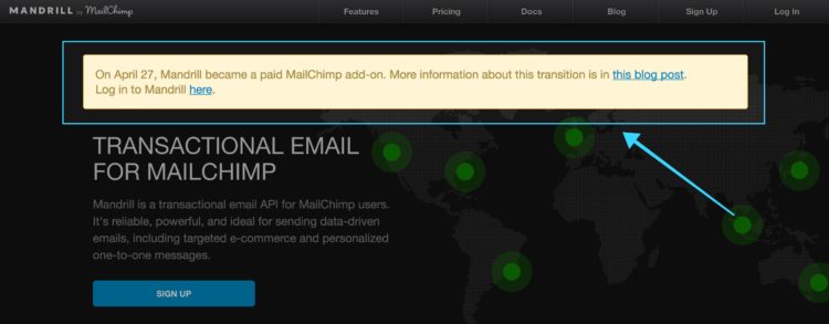
According to the blog post announcing the decision, it will eventually be renamed MailChimp Transactional.
Understanding this decision starts with understanding the 2 types of transactional emails:
- The uber simple ones like password reminders, account notifications, etc.
- The more complicated ones like personalized ecommerce product recommendation emails that need to be “wrapped in a beautiful design that perfectly represents their brand.”
MailChimp believes they’re better suited to tackle innovation in the second type. Ben wrote:
“MailChimp’s innovation style is all about democratization. We want to build sophisticated, enterprise-grade solutions, and make them more accessible to small businesses (we do that by making it fun and affordable). We came to a fork in the road, and choosing the “personalized transactional” path with Mandrill suits us and our customers better than the ‘utility’ path.
As they say, ‘culture eats strategy for breakfast,’ so no matter how compelling or strategic it may seem to conquer the utility transactional space, MailChimp’s cultural DNA compels us to innovate on e-commerce personalization.”
Like I said earlier, marketing tech has become so increasingly democratized that more and more small businesses expect to be able to use the types of tools and strategies that historically were available only to enterprise businesses with tons of cash.
As more and more customers will come to expect the capability to send intelligent transactional emails, MailChimp wants them to look no further than within the very same account they’re already using.
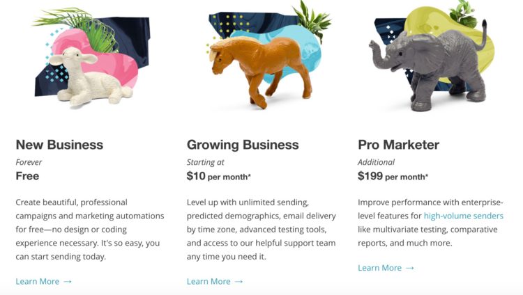
They’ll continue to focus on “scale, not whales,” but the best way to do that will be giving their “New Business” and “Growing Business” customers tools that will help them become “Pro Marketer” customers (while also continuing to beef up that offering):
One of the interesting things about the Facebook and Google ads features they’ve added in 2017 is that MailChimp isn’t getting a cut from either company, and customers don’t have to pay anything extra to use the features.
Their sole motivation for adding the features was that they can help customers grow. Which is also why they made their previously premium automation features free back in May:
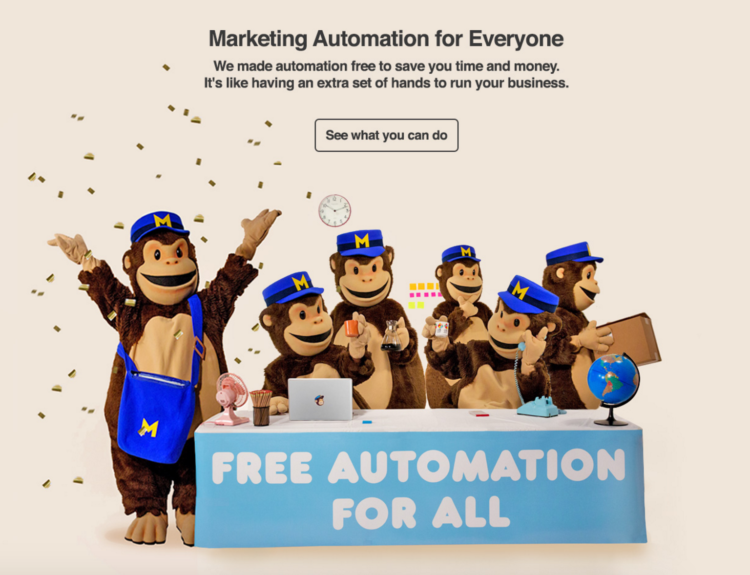
When customers grow, they eventually end up paying more for MailChimp—provided the feature set remains robust enough to meet their growing needs.
In other words, they’ve tied their business model to their customers’ success.
A few things I wouldn’t be surprised to see them add in 2018:
- More methods for capturing email addresses (continuing the trend they started by adding landing pages at the end of 2017)—the easier it is for customers to grow their lists with MailChimp, the faster they end up paying more money
- A chat widget for your site or store
- Direct mail (spoiler alert: they’ve already said they’re testing a service that will let you automatically send postcards to customers)
- SMS messaging or deeper integrations with platforms like Facebook Messenger
As Inc.com wrote in their Company of the Year feature, “It’s planning a platform that will put a small-business spin on the enterprise-sales software Salesforce is known for.”
That’s a helluva problem to solve, but after all this digging into MailChimp’s history, I know this: it’s going to be fun watching them tackle it.
