Earlier this week, IHOP announced that it changed its name to IHOb.
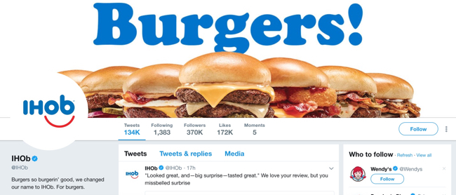
The International House of Pancakes became the International House of Burgers:

They broadcasted the change all over social media, proclaiming to be all in on burgers from here on out:
All in is all we know. Come try one if you want a new legend in your life.
— IHOb (@IHOb) June 11, 2018
But what became of their website?
How did they decide to communicate such a monumental change to their website visitors?
Let’s find out! Just click the right arrow below to get started with the breakdown.
Tip: If you’re on mobile, turn your phone to landscape for the best experience.
Breaking Down IHOP’s New Homepage Copy
But wait…is the name even changing?
The odd thing (at least one of them) is that if you do a little reading, you’ll find out the IHOb name change is just temporary.
Would you know that at all from looking at the website? Not really. You’d just see what looks like a haphazard rebrand.
But I think the way they updated their website exposes something deeper—a total lack of care about the customer’s online experience.
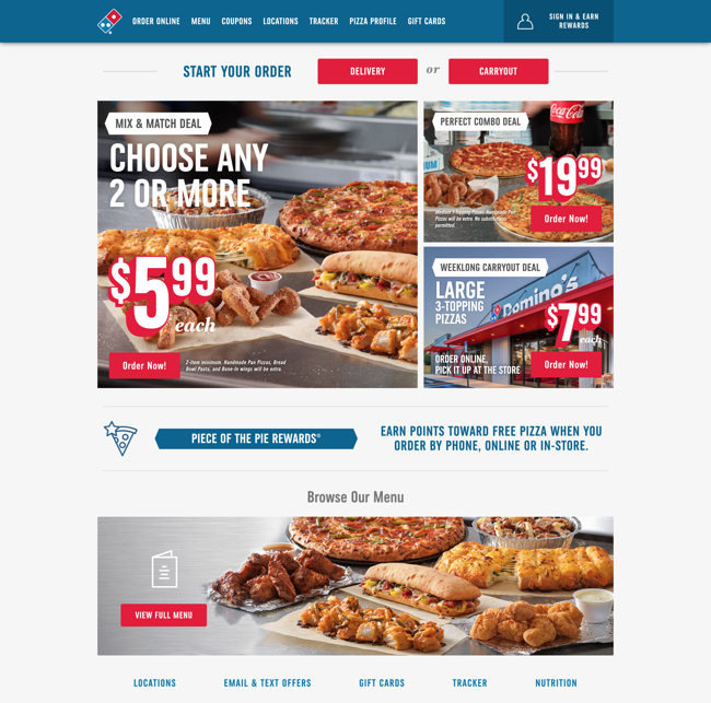
Contrast IHOP’s site with a restaurant chain that’s actually doing well and the experience is night and day. Take Domino’s, for example:

They know exactly what visitors come to their site to do and they make it easy for them to accomplish those things.
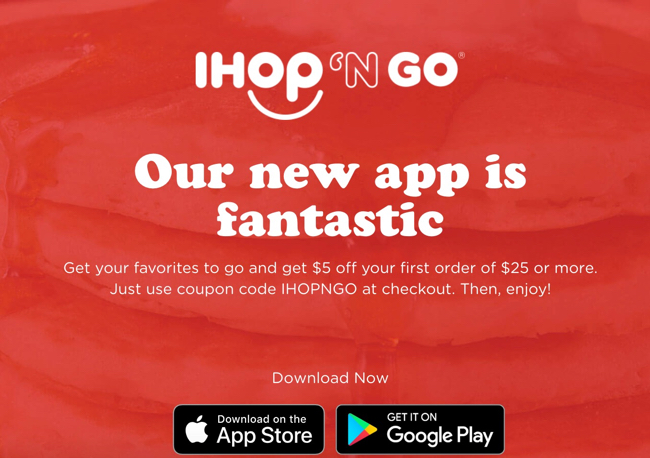
IHOP treats their site like a bulletin board instead of a tool that actually helps visitors accomplish something. The section about their app is particularly emblematic of this:

Think about how much you have to read and think just to understand the app is designed to help you order food.
If IHOP wants to turn around sales, they should probably start by focusing on their customers instead of publicity stunts.
