This week, we’re taking the copy from the above-the-fold areas on two prominent brands’ home pages and pitting them against each other.
Who are the contenders? Our two favorite purveyors of quality, reasonably-priced razors and bathroom accessories, Dollar Shave Club and Harry’s!
Harry’s was co-founded by Jeff Raider, who also co-founded the company that made everyone want to wear glasses, Warby Parker. As the company website says:
Harry’s was built out of respect for quality craftsmanship, simple design, modern convenience and most importantly for guys who know they shouldn’t have to overpay for a great shave.
As Dollar Shave Club Founder and CEO Mike Dubin recently told Tim Paige on the excellent ConversionCast Podcast, Dollar Shave Club was founded to “[solve] a really big problem for guys, which is that razors are overpriced and the experience of buying them in the store is really frustrating.”
While their missions may sound pretty similar, there are big differences that will become apparent as we get into this showdown.
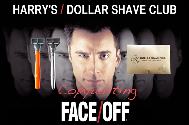
I couldn’t resist. Thank God for gloriously ludicrous ’90s action movies that give me blog post ideas.
The Battleground: The Home Page – Above the Fold
I wanted to narrow down the battleground for this post as much as possible to demonstrate just how much can be at play in an area containing only a handful of sentences.
So for this face-off, we’ll be comparing the content above the fold on the two companies’ home pages.
“Above the fold” refers to the area of the home page you can see without scrolling. Why focus on this area? Because according to conversion expert Peep Laja of ConversionXL, above the fold content still grabs 80% of our attention.
This is the part of your site where it’s important to convince visitors to take the one action you most want them to take.
Let’s see how Harry’s and Dollar Shave Club stack up. (Disclaimer: Mobile was not taken into consideration for this post. This is judging based on desktop view only.)
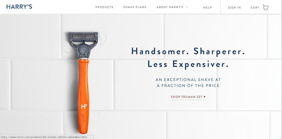
Harry’s – Above the Fold
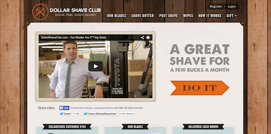
Dollar Shave Club – Above the Fold
Factor #1: Headlines + Subheadlines
At first glance, it appears Harry’s and Dollar Shave Club are preaching the same message with their headlines/subheadlines (Harry’s has a subheadline, DSC does not):
Harry’s:
Handsomer. Sharperer. Less Expensiver.
An exceptional shave at a fraction of the price.
Dollar Shave Club:
A Great Shave For A Few Bucks A Month
Pretty much the same, right? Both are preaching a quality shave at an affordable price…right?
Well, not exactly. Let’s take a look at the subtle differences that factor into totally different customer experiences.
1. “A Few Bucks” vs. “Less Expensiver” & “a fraction of the price”
- “A few bucks” is conversational and down-and-dirty. “Less Expensiver” is whimsical yet dignified.
- “A few bucks” sacrifices any perception of top-notch quality in favor of value. “Less Expensiver” and “a fraction of the price” speak to a good deal (which everyone loves), without alienating customers who want to keep it classy (or at least the perception of classiness). After all, a Honda Accord is certainly less expensive and a fraction of the price of an Acura RLX…but it’s still pretty damn nice.
2. “A Great Shave” vs. “An exceptional shave”
- If you haven’t noticed, everything is “great” now. Or “awesome.” Be it the 3-hour Springsteen concert you attended last week or the Jack-In-The-Box chicken biscuit you drunkenly wolfed down afterward…they were both “great.” “Exceptional,” on the other hand, is used in conversation by approximately .001% of the population. It means what “great” meant when we used it to describe things like The Greatest Generation and The Great Depression–things that distinguished themselves in unprecedented fashion.
- Some guys don’t need a shave that distinguishes itself. They just want to get it over with quickly and painlessly. But others want an experience. They want exceptional. Both companies are aware of this, and both speak directly to their target audiences instead of trying to sell to everyone. Let’s call it a draw.
The Headline Verdict: DRAW
Factor #2: Visuals
Let’s face the facts, copywriters. Sometimes words aren’t enough. High-quality images and video are increasingly necessary complements. And don’t forget that copywriting is as much about what is not written as what is written.
For visuals, Harry’s opted for a super-clean image featuring their flagship razor resting on a stark, white tile background, a few water droplets sprinkled in for depth. Not only is it clean from a design standpoint–it makes me feel clean.
The carefully chosen “Totally Orange” Truman razor (the Truman also comes in “Nautilus Blue,” “Ivory,” and “Olive 107”) pops like crazy against the white tile, immediately drawing your eyes and showing off the company’s craftsmanship.
It really makes for a beautiful above-the-fold experience.
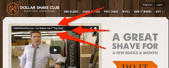
Unfortunately for Harry’s, Dollar Shave Club has an ace up its sleeve–a video that I’m sure you’ve seen, given that it has been viewed 14,526,659 times as I type this.
But the video doesn’t score points simply because it went viral. The video scores points because over TWO YEARS LATER…it’s still getting comments like these:


So that’s two guys who bought sheerly because of the video and one woman who admits to stealing her husband’s razors and then cracks a joke from the video.
Harry’s visuals make you admire the product’s look and quality.
Dollar Shave Club’s video makes you fall in love with the brand while clearly delivering the company’s pitch.
If you’re trying to emulate these pages, it’s a safer bet to emulate what Harry’s has done visually. A stunning product photo is a lot easier to create than a truly viral video.
But you can’t argue with results, which is why Dollar Shave Club takes this round.
The Visuals Verdict: ADVANTAGE DOLLAR SHAVE CLUB
Factor #3: Call-to-Action
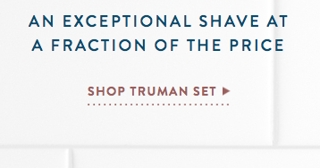
Harry’s:
“Shop Truman Set” linked text + arrow
Dollar Shave Club:
“DO IT” button
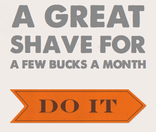
Let’s take a look at the factors at play with these calls-to-action. (What, you thought I was going to use the incorrect “call-to-actions” as the plural form? THINK AGAIN, SON.)
1. The Copy
Neither company really overthinks it with the CTA copy. But since this is such a prestigious, mid-’90s Nic Cage action movie-inspired competition, it’s time to nit-pick.
I’m not a huge fan of Harry’s usage of “Truman Set” in the CTA. At this point, the customer may love the razor, but who says he wants a set? What is a set, anyway? No one mentioned a set. The image just shows one razor.
“DO IT,” on the other hand, is fine. That’s not to say it couldn’t be improved with some simple split tests, but there’s no reason to fault it without data.
2. The Visibility
These calls-to-action do have one big thing in common: neither one is the first thing that grabs your attention after the headline.
In the case of Harry’s, the razor definitely grabbed my attention before the CTA. Not that there’s anything wrong with that. In fact, seeing the razor made me instantly like the product. I’ll sacrifice a little CTA visibility for that.
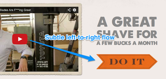
Dollar Shave Club, meanwhile, grabs your attention with the video and its ever-present temptress, the “play” button. But again, the video does so much to sell the viewer on DSC’s service that the “DO IT” button’s secondary prominence is completely irrelevant.
The biggest CTA-related error, however, is committed by Harry’s. This is where they tried to make things too pretty and forgot that the #1 priority is to sell products.
The CTA calls virtually no attention to itself. Sure, the dark reddish color differentiates the CTA text from the headline text. Sure, the text is underlined. Sure, there’s a little arrow at the end. But there is nothing that grabs the visitor and makes you want to click it.

Awww cute…look at that itty-bitty CTA.
The Dollar Shave Club arrow button may not fit in as nicely or seem as aesthetically pleasing, but it pops off the page and forms a subtle connection with the video player arrow that makes clicking it the logical subconscious next step:
The Call-to-Action Verdict: ADVANTAGE DOLLAR SHAVE CLUB
Factor #4: Overall Context
The previous three factors can’t be judged in a vacuum. The following questions must be addressed:
1. What result is each company after with its above-the-fold content?
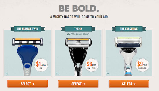
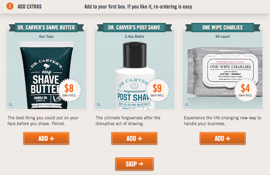
Dollar Shave Club’s above-the-fold content is all aimed at getting you to begin the 4-step sequence for joining the club. It goes something like this:
- Click the “DO IT” button.
- Select your razor.
- Add extras to your first box.
- Enter your shipping info and create your account.
- Enter your payment info and officially join the club.
Judging solely on their above-the-fold content, Harry’s goal with this section of their website is to get you to shop the Truman Set.
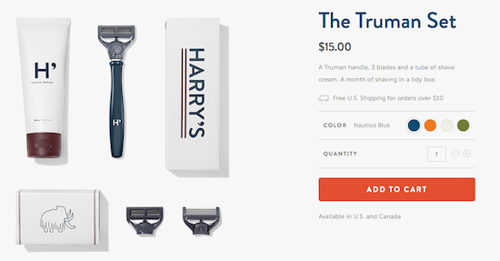
This seems a bit odd given that they too offer recurring fee “Shave Plans” that send razors and accessories right to your door. It seems that a Shave Plan customer would be worth more than one who orders a $15 shaving set, but perhaps the numbers would back up Harry’s decision to focus on pushing individual sets over the Shave Plans.
2. Did each company create above-the-fold content that will speak to its target audience?
I give a “yes” to both companies for this question.
Dollar Shave Club created a video and copy that speaks directly to their average Joe, 18-34-year-old customers. They rail against the inconvenience and unnecessary bells and whistles of modern razors and entice customers to stand out and join the club of people who are ready to shave on their own terms.
They also throw in a highly visible usage of “F***ing Great” in the video title. Like Joanna Wiebe recommends, Dollar Shave Club writes for the 20-35% of people who will love the fact they displayed “F***ing Great” so prominently.
Harry’s created above-the-fold content that exudes classiness with a hint of practicality. They make you fall in love with the product as a thing instead of its ability to perform its task (that comes later). As opposed to the average Joe looking to just avoid unnecessarily inconvenient and expensive trips to Target, the Harry’s customer wants a way to enjoy the actual process of shaving without overpaying.
The Overall Context Verdict: DRAW
The Final Verdict
While I really like what both of these sites are doing, I have to go with Dollar Shave Club. Their combination of clear copy that speaks their customer’s language, straightforward design, a clear CTA, and an above the fold area that fits in perfectly with their #1 goal makes DSC the clear winner.
While Harry’s page certainly wins the “Which Page Would I Want to Stare at All Day” contest (it really is beautiful), their CTA is not as straightforward or as clickable.
Did I make the right choice? Which above the fold area do you think converts better? Is Face/Off better than Con Air?! Leave a comment and let me know your thoughts!
