Every now and then, you come across a company whose copy can only be described as swipe-worthy.
By swipe-worthy I mean that almost anytime you see them trying out a new headline or testing a new web page design, you immediately screenshot it and tuck it away for inspiration in what copywriters often refer to as a “swipe file.”
You don’t save it to copy it, but to study it. You feel like something special might be at work, and you want to know why. At the very least, it can be a source of inspiration.
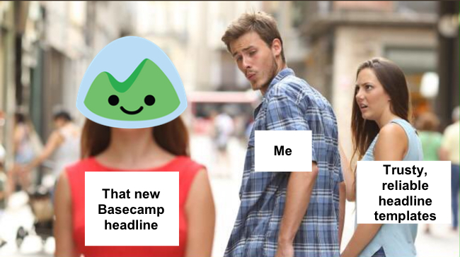
To me, Basecamp is totally swipe-worthy. Here’s a meme that captures my feelings toward it:
So, why is their copy worth paying attention to?
- They consistently go against the grain. They’re willing to take risks and stand out from everyone else in their space (project management software). You’ll see stuff other companies wouldn’t think of trying.
- From the top down, they’ve put serious thought into copy for well over a decade. I love this quote from a blog post CEO Jason Fried published all the way back in 2003 critiquing a redesigned page on ESPN.com (my emphasis added):
“Bad copywriting is the biggest cancer on the web today, and ESPN continues that tradition by lathering on the jargon and washing away the simple, easy-to-understand language that is required at a critical contingency design crisis point. If you are going to ask someone to do something, you better speak their language and put things in their perspective.”
- They consistently test their copy and design, so you know they’re keeping an eye on what works and what doesn’t. While that doesn’t mean what works for Basecamp will work for you, it’s still worth studying how and why they do things. That’s the part you can take and apply to your unique product and market.
I’ve kept tabs on Basecamp over the past several years, but I recently got the urge to go deeper. So I used the wonderful Internet Archive to go back and analyze every different Basecamp home page variation I could find since they launched back in 2004. Specifically, I focused on the headline, subheadline, and above-the-fold area.
In all, I looked at over 55 different home page variations to see how their copy has evolved, what’s remained consistent, what messages they’ve focused on, and more.
In this post, I’ve published two things:
- A fun, visual tour of the last 13 years of Basecamp home pages, so you can actually see how it’s evolved.
- The 10 biggest takeaways I had from studying the pages themselves and what Basecamp employees have written about them.
Obviously, their success can’t be laid solely at the feet of their website copy, but I think examining how it’s evolved over the years holds a lot of lessons into their success and the brand they’ve built.
Part 1: A Visual Tour & Breakdown of the Basecamp Home Page: 2004-2017
The visual breakdown works like a slideshow: just click the arrow on the right side to advance (after you click the first time you can simply use your arrow keys).
Tip: If you’re on mobile, turn your phone to landscape for the best experience!
Part 2: My Top 10 Takeaways from Analyzing 13 Years of the Basecamp Home Page
After creating the visual breakdown, I found myself wishing I’d had more room to talk in greater detail about a few my biggest takeaways from analyzing not only the pages themselves, but the tons of blog posts, articles, and even books Basecamp’s employees and founders have published.
That was one of the coolest things about studying all this stuff—many times when I noticed something cool going on with their copy or design, I found that someone at the company had written something that gave insight into the thinking behind it.
So below you’ll find all the good stuff that was too difficult to fit into the visual breakdown.
1. Pay special attention to “the why before the why.”
Basecamp speaks to emotions and feelings in their copy to a degree that I think would make many software companies uncomfortable.
Look at the first few lines on this home page they tested earlier in 2017:
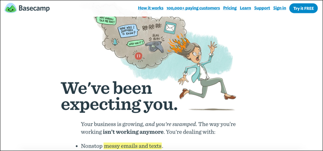
“Your business is growing, and you’re swamped. The way you’re working isn’t working anymore.”
You just don’t see many B2B software companies as prominent as Basecamp kicking off their home pages with copy that cuts to the core like that.
Reading back through their blog showed me a couple reasons why their copy stands out so much:
1. They don’t just focus on why their customers buy—they focus on why they shop in the first place.
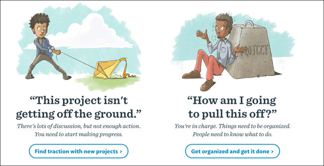
Jason Fried calls this “the why before the why.” They interviewed customers and found that one of four situations usually led them to begin shopping for a project management solution. Basecamp described each with a quote:
- “We can’t keep working like this.”
- “We can’t mess up like that again.”
- “This project isn’t getting off the ground.”
- “How am I going to pull this off?”
There’s a reason features and benefits dominate most companies’ copy—most companies are much more focused on why customers buy than why they shop.
2. They try to keep language conversational.
Jason Fried wrote a short article in February 2017 about how easy it is to overcomplicate things we’re trying to explain. He described how this challenge slips into everything from conversation to writing home pages:
“I was working on some copy for a new home page design and I just wasn’t locking into my point in writing… So I said a few things out loud. They were better than anything I’d written, but then when I wrote them down I tried doctoring them up a bit because ‘marketing’ and, once again, they fell flat.”
This is a great defense mechanism against the crutch-speak marketing language I mentioned earlier. Striving to write the way people talk about problems, solutions, and products will help you avoid defaulting to the lifeless stuff that inundates us every day.
2. Resist default language.
We’re all guilty of what I call “crutch-speak”—those phrases we tend to fall back on again and again that do nothing to strengthen our message.
That’s why you see product after product that describes itself as “the easy way,” “the faster way,” “the simplest way,” etc. Even though people often want fast, easy, and simple, those phrases lose their punch when everyone’s using them.
For the most part, Basecamp avoids these overused phrases. And they sometimes do it in spectacular fashion. Like in the third sentence of this paragraph:
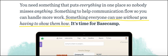
“Something everyone can use without you having to show them how”—it conveys ease-of-use without falling into the typical “easy way” crutch-speak.
Or how about here:
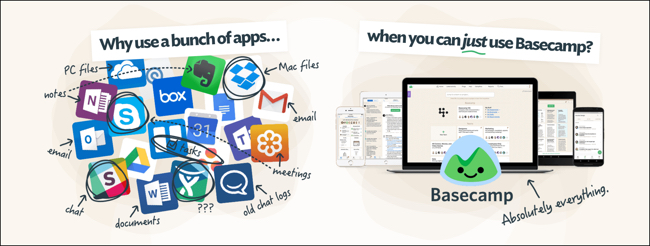
This conveys simplicity much more powerfully than if they’d just said it’s “simple to use.”
3. It’s hard to have too much customer language.
If you looked through the visual breakdown, you probably noticed how customer language has played a big role on Basecamp’s home page since Day 1.
They even tested one variation in 2016 that featured 49 (!) testimonials.
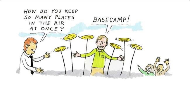
But they’ve done a lot more with customer language than just stick it in testimonials. They’ve used it to depict conversations…
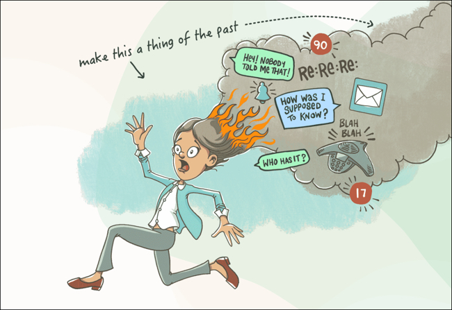
mimic the stress-induced chatter typical of hectic projects…
and show the emotions their prospects are usually wrestling with thanks to poor project management:
This backs up what Jason Fried wrote in the quote I mentioned at the beginning of the post: “If you are going to ask someone to do something, you better speak their language and put things in their perspective.”
In fact, 23% of text on their current home page is pulled directly from customers’ mouths (74 out of 314 words).
When you talk to customers, remember how they describe their problems, the solutions they’re looking for, and your product. Their language can improve—and even replace—your copy.
4. Let visuals take some pressure off your copy.
Too often, visuals are a wasted opportunity on web pages.
We see a spot where it feels like a visual belongs, so we just stick something there that looks nice, never really thinking about the job that visual should have.
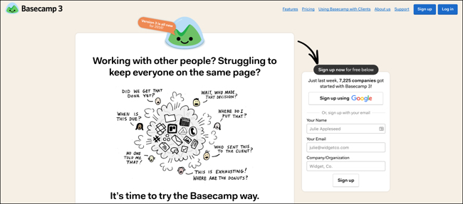
I found Basecamp’s visuals to consistently convey ideas that either reinforced their copy or replaced it. Like this one:
It can work in non-obvious ways, too. For example, the very first Basecamp headline said “An elegant web-based project management and client extranet tool for creative services firms.”
The first time they updated their design, they added an image of the Basecamp dashboard that communicated the same information as the original headline, freeing up the new headline to focus on something else:
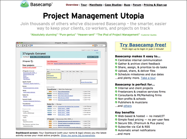
The dashboard communicates everything that original headline did: it’s a web-based project management tool.
5. You can call yourself #1 without saying “We’re #1.”
Basecamp has long been among the market leaders in the project management space, and they’ve gone a good job at communicating that without falling into the “we’re number one” trap Al Ries and Jack Trout described in the classic marketing book Positioning:
“Why isn’t it a good idea to run advertising that says, ‘We’re No. 1’? The reason is psychological. Either the prospect knows you are No. 1 and wonders why you are so insecure that you have to say so. Or the prospect doesn’t know you are No. 1. If not, why not?”
They’ve found several different ways of conveying their market leader status more effectively (usually with snippets of copy like, “Last year, Basecamp helped over 250,000 companies finish more than 2,000,000 projects”), but I’m particularly partial to what they’re doing at the bottom of their current page:
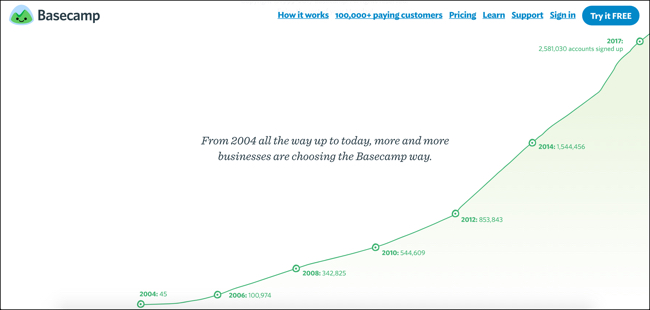
“From 2004 all the way up to today, more and more businesses are choosing the Basecamp way.”
This communicates that Basecamp is more than just software, it’s an entirely different (and saner) way of working—and they have the numbers to prove how much people love it.
You can’t talk your way into being #1 in your prospect’s mind—you either are, or you aren’t. So shoot for something you can convey with words.
6. Don’t be afraid to state what might seem obvious.
Whenever I’m working on optimizing a web page, I always ask myself: What seems like it should be obvious to visitors but might not be?
When you look at a web page through that lens, you can unlock lots of opportunities for improvement.
One of the things that stood out on some of the older versions of Basecamp’s home page was how easy they made it to sign up. How did I know it was easy? Because they made it loud and clear. Check out the parts I highlighted in this screenshot from 2006:
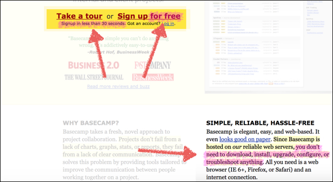
It’s free, you can sign up in less than 30 seconds, and you didn’t have to download anything (it’s easy to forget that was much less common in 2006 than it is now).
Sure, that’s a lot more text than just saying “signing up is fast and easy,” but doesn’t it communicate so much more?
7. You’ll get criticized for looking different. That’s OK!
It’s easy to forget that, for as much praise as Basecamp gets for bucking trends, they also get criticized for it.
Listen to some of these comments from a 2013 Designer News discussion that posed the question, “Does anyone else find the Basecamp home page a little ‘strange’?”:
- “It feels way too marketing driven, and yes… very 90s-esque.”
- “Funny. There a little late on April’s Fools this year.” ← (I kept the typos in this quote.)
- “My hunch is they’ve split tested the shit out of a ton of designs, and this monstrosity converts the best.”
Guess what? Given Basecamp’s propensity for split testing (which I’ll discuss more in a moment), that “monstrosity” probably did convert the best! And if that’s the case, it’s worth considering what another commenter on that discussion said:
“I’d say that, if this design converts well, it’s, ipso facto, ‘good’ design.”
Jason Fried gave some insight into the company’s tendency to go against the grain just last week in a post called “Look elsewhere”:
“So here’s my advice: Look outward. Turn away from your industry and venture beyond the business world for inspiration. If you’re about to make software, instead of checking out the Top 10 apps in the App Store, try looking through a book on architecture.”
That’s why I’m not advising that you 100% style your copy like Basecamp’s, but instead consider applying aspects of the thinking that went into creating their copy the next time you’re writing your own.
8. Clear and clever can coexist.
I’ve written before about the “clear vs. clever copy” debate before (tl;dr — clever copy can work great, as long as your offer, the problem, or the solution is still clear) and I think Basecamp offers some great examples of clever and clear coexisting.
Check out one of their current home page variations:
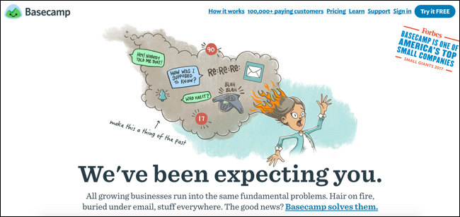
The illustration is creative and the headline is anything but typical. But put them together, along with a subheadline that offers a clear description of the prospect’s problems, and you get a powerful message that cuts through the typical project management software marketing noise.
Here’s another good one they were testing at the beginning of 2017:
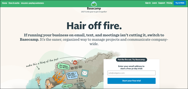
Clever headline. Super clear subheadline. In perfect harmony.
9. Even if you have good reason to make big changes, test them.
Sometimes, you need to make a major update to your home page for branding reasons rather than conversion rate optimization reasons.
That’s exactly what Basecamp needed to do back in 2014, when they changed the company’s name from 37signals to Basecamp (and stop working on their other products like Highrise). So they updated the home page to the design below without testing it against the previous version:
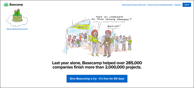
The result? It cost them millions of dollars in lost signups (as chronicled in this blog post).
Eventually, they figured out that removing the signup form from the page was the likely culprit of the conversion rate decline. Once they started testing a version of the redesign with a signup form on the page, conversions ticked back up to where they used to be.
Noah Lorang, their data scientist who uncovered the problem, summed up this lesson nicely:
“It’s easy to decide not to test a change—you’re busy, you just know it will be better, you don’t want to risk the confusion that’s always possible anytime you’re running a split test. In the future, it will be easy for us to justify spending the time and effort to test a marketing site redesign thoroughly in the future – we’ve learned the hard way what can happen if you don’t do that.”
Testing takes time, but the decision to skip it can be costly.
10. Test radically different things.
You notice something pretty quickly when looking through the variations Basecamp has tested over the years—the tests are easy to notice.
Rather than testing tiny things like button color, they swing for the fences, aiming not just for big gains, but big learnings.
This 2011 blog post about their A/B testing philosophy from Basecamp designer Jamie Dihiansan explains why:
“Jason Fried’s mantra while testing was: We need to test radically different things. We don’t know what works. Destroy all assumptions. We need to find what works and keep iterating—keep learning.”
“Keep learning.” A massive benefit of testing that’s often overlooked.
What Have You Noticed About Basecamp?
Believe it or not, as long as this post is, I could keep going. In fact, I edited out quite a bit from the visual breakdown and the rest of the post before publishing.
There’s a ton of meat on the bone when looking at 13 years of a company like this! I’m curious—what did you notice after seeing how the Basecamp home page has evolved? Leave a comment below and let me know.
