NOTE: I’m trying something new with this post. I’ve created an invite-only swipe file full of the examples of delightful copy I share in this post. I’m going to continue updating it with every example I find beyond this post, and I’m inviting you to do the same. Just click here to get your instant invite to the swipe file! Let’s build a massive swipe file of copy that delights together.
P.S. Already a subscriber? There’s a link to the swipe file in the P.S. of the email you got about this post. 🙂
When I ask entrepreneurs what the number one result they’re trying to get for their business is, the vast majority give me the same answer.
Any guesses?
If you’re also an entrepreneur, you probably guessed correctly:
More customers.
It’s beyond obvious why getting more customers is an intense desire for business owners.
Hell, that desire is what fuels much of the entire marketing industry.
The proposition of gaining new customers is what has turned Google into a $400 billion dollar company (91% of their revenue came from advertising in 2013).
And while it’s true that some of these advertising dollars are being spent to retain or upsell existing customers, the majority is being spent by companies in hot pursuit of new ones.
Creating awareness and attracting new leads into the top of your funnel will always be important, but what if the biggest opportunity for your business right now actually came from focusing inward instead of outward?
The One Stat That Could Flip Your Sales Funnel on Its Head
The intense desire we all have for gaining new customers often overshadows another sure-fire moneymaker: retaining existing customers.
Although you’ve probably heard it before, it bears repeating that, according to most sources, it costs between 4 to 10 times more to acquire a new customer than keep (or sell to) an existing one.
This is why many marketers focus on converting leads into customers with a small sale before pitching a big sale. Customers simply convert better than non-customers.
That’s why Amazon doesn’t profit off of Kindles. They profit on all the stuff customers buy after they buy the Kindles.
In his book The Automatic Customer, John Warrilow described how Anne Holland (founder of MarketingSherpa and WhichTestWon.com) utilized this tried-and-true principle at MarketingSherpa to make the bulk of the company’s money.
According to Holland, everyone assumed they made most of their money from the $7 case studies they sold. But the reality was quite different:
“Holland employed a full-time telemarketer who called people who had ordered a $7 case study. First, the telemarketer would ensure that the customer had received the case study and then would follow up with an invitation to a live event on the same topic. ‘We ended up selling 900 tickets to a $1,500 conference just because we called someone who bought a $7 article.’”
Once your business is up and running, your best customers are most likely going to be the customers you already have.
This post is going to show you one specific area of your business where you can dramatically increase your customers’ chances of buying more from you, and of spreading the word about your business to others.
This area is where your copy can cause you to either:
a) Create raving fans who are always ready to buy the next thing you’re selling.
or
b) Fade into the background as another faceless figure in the crowd of companies trying to win your customer’s love.
This area is User Experience Copy.
What’s User Experience Copy?
For some reason, most people reserve the term “user experience” exclusively for software products—but every product has a user experience, whether it’s email marketing software like MailChimp, an online course, or a bottle of shampoo.
Regardless of the kind of product you’ve created, copy can have a major impact on how a customer uses it. In almost all cases, it will contribute to whether your customer has a positive experience or a negative experience.
Take Dollar Shave Club, for example:
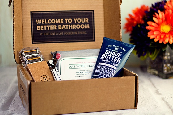
You better believe the copy on the box and the products contributes to the overall user experience for Dollar Shave Club customers. Each word is an opportunity to make customers fall in love just a little bit more.
The Key Customer Metric You Should Focus on Increasing…Even Though You’ll Never Be Able to Measure It
As we dissect user experience copy, it will become clear that most of its objectives are united under an overarching goal: customer delight.
That phrase can make even the most conscientious of marketers want to pull their hair out.
Why? Three big, elephant-in-the-room-sized reasons:
- You cannot measure delight.
- You cannot know the precise ROI delight gets you.
- You’ll never be able to deposit delight at the bank.
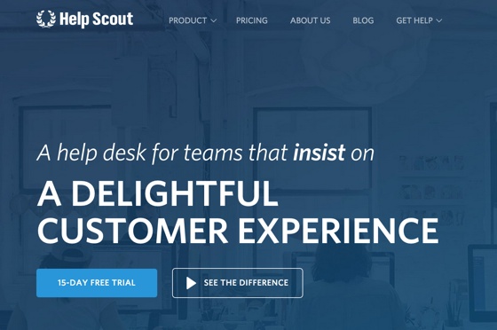
Still, most businesses seem to recognize delight’s importance. Help desk software company Help Scout have even rolled the mythical feeling into the headline on their home page:
Delight is something Apple has frequently focused on over the years.
“We love our users,” Steve Jobs once said. “We try very hard to surprise and delight them, and work our asses off doing it.”
This is what led MailChimp founder and CEO Ben Chestnut to drop quite the delightful bombshell with a public critique of the traditional marketing funnel, aptly named “Why I Hate Funnels.”
“When you start a business, you don’t have a budget for marketing. You probably don’t have the time or talent for it, either,” Chestnut wrote.
“The only thing you’ve got is your passion. That damned, trouble-making passion that suckered you into starting your business in the first place. Take that passion and point it at your customers. Deliver awesome customer service. Delight them.”
He then literally flipped the traditional marketing funnel on its head, proposing the alternative model that has guided MailChimp to becoming one of the most-loved email marketing platforms out there:
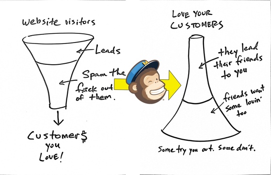
This post isn’t about recommending one type of marketing funnel over the other. Instead, it’s about unlocking that mythical quality in your copy that so many top-performing companies seem to be obsessed with: delight.
Want to delight your customers with words? Then read on.
User Experience Copy: How to Write Copy That Will Make Using Your Product a Joy
Although I mentioned that user experience applies to all products—not just software—earlier, it turns out that one particular software product serves as a perfect example for user experience copy that makes customers fall in love.
By now, it should come as no surprise that I’m talking about MailChimp.
I’ve used a decent number of email marketing services over the years, and MailChimp stands way out in front when it comes to ease of use. When I’m using it, I just know what to do.
This of course is owed to much more than just the copy inside their application—the user interface, the flow of information, and much more contributes to an overall fantastic user experience.
But there’s one thing their copy does that makes their platform approachable for users of all skill levels…
It appeals to the emotions the user is most likely to be feeling.
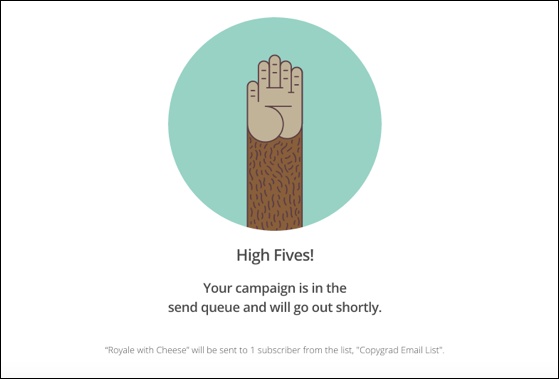
MailChimp’s copy does something that became so underrated in marketing that it now seems overrated: it empathizes with the user.
But you don’t need another article telling you how important empathy is to understanding your customer.
So instead, I’ll show you how MailChimp creates empathetic copy so you can apply the same principles to the copy inside your own product.
Hint: There’s a lot more involved than just high fives.
Here’s how they do it:
1. They Acknowledge the Full Range of Their Users’ Emotions
Let me guess—when you built your product, you thought through every possible roadblock your customer might encounter.
You made it ridiculously easy to use. So easy, in fact, that nothing could ever possibly go wrong.
Strangely enough, that’s how everyone feels when they invest a ton of time into building something great:
I’ve created the thing that finally eliminates all the frustration and confusion people have when they use [INSERT COMPETING PRODUCT HERE]!
And yet support questions, frustrated customers, cancellations, and demands for refunds persist.
It’s not because you failed—it’s because there is no such thing as a user experience free of any negative emotions.
Consider this: even though I love using MailChimp and have sent out enough email campaigns to do one in my sleep, I still get ridiculously nervous every time I’m about to hit that final “Send” button.
Did I select the right list?
Did I select the right segment?
Is this really a good email?
Will people get that lame attempt at humor I made in the second paragraph?
Oh crap, do all the links work? I checked them twice, didn’t I?
Just thinking about it makes me want to sweat. And I’m not alone in this. Even my friend Chris Davis, who is Head of Marketing Automation at LeadPages, has told me he gets nervous every time he’s about to send a broadcast—and he’s proficient in just about every single email marketing platform and CRM you can think of. That’s not to mention the fact that he’s been in charge of managing hundreds of thousands of subscribers over the course of his career.
Even the most frictionless user experience imaginable couldn’t hold back this feeling. So why do I always experience a quick burst of courage that pushes the fear out of the way whenever I’m about to hit “Send” in MailChimp?
Because they didn’t pretend their product had cured my anxiety. Instead, they embraced it.
This is what you see when you’re about to send an email campaign inside MailChimp:
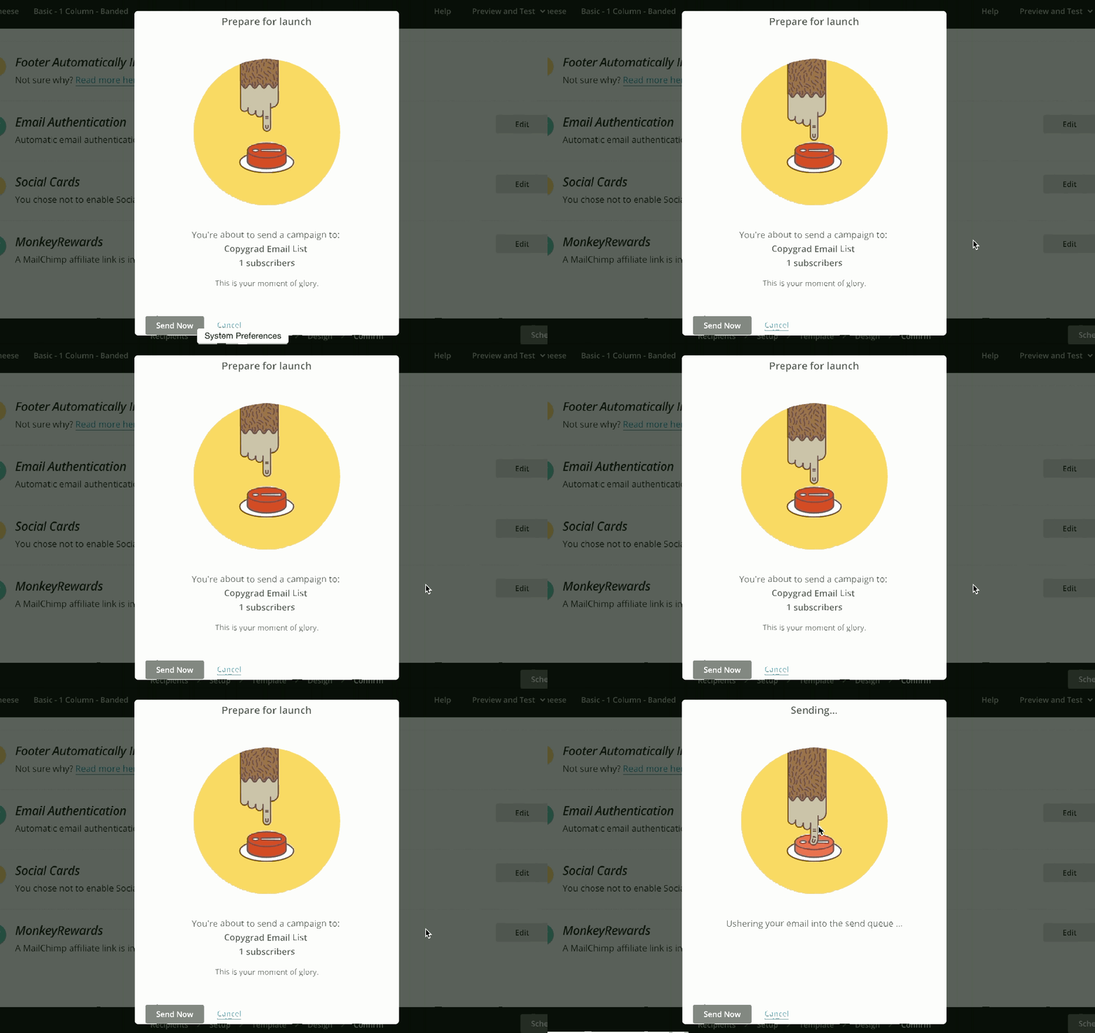
The first time I saw this all I could do was smile. My anxiety didn’t completely leave, but it was balanced out by newfound courage. All because of three little elements MailChimp included:
1. That small line of copy at the bottom: This is your moment of glory.
2. The quick summary that reminds me which list my email is going to and how many subscribers are on it. OK good, that’s who I thought I was sending it to.
3. The nervous monkey hand that shakes when it gets close to the scary-looking “Send” button. This was the element that truly made me feel better, yet it’s counter to what you would expect MailChimp to convey to users at this moment. Why would they present a feeling of nervousness? Because they accept that users will most likely always feel a little bit nervous before they hit “Send.” This playful animation is their way of communicating what every user needs to hear in that moment:
You’re not alone.
What you’re feeling right now is normal.
That’s when they hit the user with the helpful recipient information and the encouraging rally cry:
This is your moment of glory.
Yes, the third ingredient I mentioned isn’t copy, but copy could achieve a similar effect.
The point is this: in one simple modal window, MailChimp has assembled three ingredients that add up to one hell of a delightful cocktail. Pressing that “Send” button is a tough pill to swallow, but this makes it go down easy.
Instead of ignoring the unpleasant feeling users might be experiencing, MailChimp embraced it, then helped them move past it.
NOTE: Don’t forget, I’m adding all of these examples of delightful copy to an invite-only Delightful Copy Swipe File. You can easily access every example from this post, and every example I run across in the future. You can even add your own examples for everyone’s benefit! Click here to get your instant invite to the swipe file.
2. They Talk to Their User Like a Regular Person
There’s plenty about email marketing services that’s dry and boring. I mean, just saying that term—email marketing services—makes me sleepy.
But that doesn’t mean the an email marketing service’s copy needs to be boring.
Whether you’re typing up instructions for a bag of organic coffee beans or writing a walkthrough for an online course, you can talk to your customers like they’re actual people. Contrary to popular belief, it is not a crime. Shocking, right?
A little personality can bring small moments of joy to even the most mundane tasks, like generating an API key so you can integrate another service with your MailChimp account:

Are you in an industry that shuns humor? No problem. You can still create a more engaging experience for your customers by simply being conversational, straightforward, and informative. Check out MailChimp’s activity dashboard for an example:

Worried about sounding flippant (yeah, that’s right, flippant) when talking about serious business like payments, upgrades, etc? It’s fine to set aside any playfulness for moments like these. Even MailChimp keeps things pretty buttoned-up when you start exploring upgrade options inside your account:

Nothing funny to see here, folks. This chimp is all business.
3. They Provide Help When Users Are Likely to Need It
As you might have noticed in the “straightforward and informative” example in the previous section, MailChimp also has a knack for pointing you to an extremely helpful support article in just the right situations. Here’s a closeup in case you missed it:

And another example:

These well-placed links not only help cut down on support questions, they also help customers be more successful with the product, which will ultimately cause them to stick around longer (and continue to write checks).
Again, if your products aren’t digital, don’t rule yourself out here.
Dollar Shave Club, for example, includes an insert titled “The Bathroom Minutes” with every box they send me. It includes all kinds of weird/interesting stuff like customer success stories, historical anecdotes, grooming tips, and more. Somehow, I always end up flipping through it. Last month’s even got me to add a new product onto my usual shipment of razor blades.
What additional information can you include with your product that will help customers be more successful with it, or cause them to engage with it more often?
Go Forth, and Delight Your Customers
Delight will never show up in your revenue dashboard.
You won’t see it on a Profit and Loss Statement.
You’ll never know the exact ROI creating delightful experiences for your customers produces.
But you will hear delight in the things they say to you. You’ll see it in the social media posts that praise you. And you’ll know it’s there when customer renewals, upsells, engagement, and retention rates increase.
While it’s difficult for a company to get both user experience and email copy right every time, the good news is that even if you only nail one of them consistently, you’ll be miles ahead of most other businesses.
Commit now to dedicating some time each week to focusing on creating delightful experiences and interactions with your customers. In the long run, the results will surprise you.
Question: What’s one thing you’ll do in the next week to delight your customers, or improve their experience with your product? Leave a comment below and let me know.
P.S. Don’t forget to join me and other marketers in the Delightful Copy Swipe File! Click here to get free access to the swipe file!
